 Hmm…where is that Flying DeLorean
I ordered, anyway?
Hmm…where is that Flying DeLorean
I ordered, anyway?
Remember Back to the Future? Great movie. Wouldn’t it be amazing if you could
shift Project Management back through time and see exactly
how things looked back then? Although lots of PPM Software packages have auditing
— after all, no one likes mismatched SOX — wading through a laundry
pile of data edits to reconstruct what your Project was wearing at the time is no
way to spend a Friday night.
I think Google Maps is onto the right idea. They’ve worked out a way to let
you view a geographical location as you
slide through time. And a few years back, I built a custom budgeting
database that did something similar.
We called it Time Slicing. Every Friday at noon, a routine
took a Snapshot of all of the Projects in the
budget and saved them collectively as a Time Slice. Whenever our users ran variance
reports, they could compare any two Time Slices. They’d often run the current
budget against the previous week, but would sometimes run Q1 against Q2, or perhaps
the current date against same date the year previous. The contrasts were amazing!
They could literally follow the money as the budget migrated
from one geographical area to a hotter one.
I hadn’t thought about that budgeting application in quite a while, but it
came up last month.
I’ve been advising a team that uses Workfront as their Online Project Management
Software. Their goal is to rationalize all business applications (e.g. Word, Excel,
etc.) as two huge Oil & Gas companies merge. There are over 4400
applications across 8 major business units. Ultimately, each application
has to be either Retained, Consolidated, or Decommissioned; although at the moment,
there are still several Apps that are Unknown. It’s hard to digest that much
data. To help them with work management, they asked if I could find a way to compare
this week vs last week…in other words: Time Slicing.
In the end, thanks to some timely coaching from Workfront, we figured out a solution.
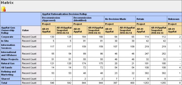
Here’s an example of our AppRat Matrix Report, which
shows how the Decisions have progressed in the past week, by Major Business Area:
There were a few tricks to get it all going:
Set Up the Custom Data
- The 4400+ Apps were being tracked in Workfront as Tasks under a single Project called
AR-01 AppRat.
- Each Task has a custom Category behind it with Parameters that note the current
state of the Decision on the App (e.g. Retain), and to which major business unit
the App belonged (e.g. Corporate).
- Both dimensions can slowly change over time.
Create a Snapshot Status
- Workfront allows users to define their own Custom Status codes.
- I called mine "Snapshot", and based it on the "Dead" Status,
to hide it on searches, and to prevent inadvertent edits of the historic data.
Create a Snapshot Group
- I created a new Group called "Snapshot". Surprised?
- The Group has NO users assigned it.
Copy the Current Project (Weekly)
- Each Wednesday at noon, I copy the AR-01 AppRat Project.
- My naming convention for the copy is AR-01 AppRat Snapshot YYYY-MM-DD.
- I also set the Status to "Snapshot" along the way.
- I then edit the copy and set its Group to the "Snapshot" Group.
- Since normal users can only see their Home Group Tasks, when they use the quick
find in Workfront (i.e. the top right drop down), Workfront prevents them from accidentally
finding the old Snapshot versions of the Tasks.
Archive Previous Snapshots (Weekly)
- By convention, I rename any previous Snapshots to AR-OLD AppRat Snapshot
YYYY-MM-DD.
- This removes them from the Matrix, but keeps them around in case I ever decide to
do multi-snapshot reports.
Build the Matrix Report
- The screen shot above was just a normal Workfront matrix report.
- The main trick was that the Filter says where Project Name Contains
AR-01, which excludes the AR-OLD Snapshots.
- From there, it was just a matter of grouping by Decision, by Project Name (which
gives the comparison column), by major business unit.
- I also tied the report to a user with enough rights in their Access Level to
see both the Current and the Snapshot tasks.
The result? When the team logs into Workfront, they now have an easy to read comparison
of where they’re at, and where they were, all in real time.
Although it’s not flying DeLorean, the Snapshot technique I described has
helped our team visualize their progress over time, without having to sift through
audit information or keep a second set of books for historic comparisons. With Time
Slices now at hand, there are sure to be many other interesting insights.
I hope I’ve given you some, too.